
How to Read Japanese Stationery Packaging
, by ZenPop Japan , 6 min reading time
, by ZenPop Japan , 6 min reading time
A beginner-friendly guide to reading Japanese stationery packaging. Learn how to understand symbols, materials, sizes, and labels with confidence.
Japanese stationery is often admired for its design, quality, and thoughtful details. But when you pick up a pen, notebook, or tape for the first time, the packaging can feel… a little intimidating.
Small icons, compact text, unfamiliar terms. What does it all mean? And how do you know if you’re choosing the right item?
This guide is here to help.
By learning how to read Japanese stationery packaging, you’ll feel more confident, make better choices, and start noticing the quiet care that goes into even the smallest everyday tools.

Japanese packaging is designed to be informative rather than decorative. Instead of bold marketing claims, you’ll often find:
Once you know where to look, the packaging becomes surprisingly easy to understand.
The product name is usually written clearly on the front of the package, often in Japanese, sometimes with simple English.

What to look for:
Even if you don’t read Japanese, the layout and typography often help you identify what kind of item it is.
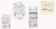
One of the most helpful parts of Japanese stationery packaging is the visual instructions.


Instead of long explanations, you’ll often see:
These diagrams explain:
If you’re unsure, follow the pictures first. They’re designed to be intuitive.
Material information is usually printed on the back or side of the package.

You may see:
Why this matters:
Japanese brands are very precise here, often listing each component separately.
Japanese packaging almost always includes recycling symbols.

Common things you’ll see these two for stationery items:
These marks indicate how the packaging should be sorted in Japan.
Even if you live elsewhere, they still tell you what materials are involved.
It’s a quiet reflection of Japan’s attention to environmental responsibility.
This is where Japanese packaging really shines.

You’ll often find exact details such as:
If you like knowing exactly what you’re getting, this section is worth slowing down for.

Some packages include small award logos or certification marks.
These might indicate:
They’re usually subtle, not flashy. Think of them as quiet reassurance rather than a sales pitch.

Near the bottom or back, you’ll usually find:
This transparency is common in Japanese products and reflects a strong sense of accountability.

You may also notice short lines of text that include:
Even if you don’t read Japanese, icons and layout often hint at their purpose. While this is usually important information, we recommend using a translation app or software to read as much as possible before using. Or you may contact the seller if you have concerns.
If you ever feel unsure about what a line of text means, Google Lens can be a very helpful companion.
By pointing your phone’s camera at the packaging, Google Lens can translate Japanese text into English almost instantly. This is especially useful when checking:
While Japanese stationery packaging often includes clear diagrams, some details — especially safety-related ones — are still written only in Japanese. Using Google Lens adds an extra layer of confidence, helping you avoid misuse and enjoy the product as intended.
Think of it as a gentle safety net: you may not need it every time, but it’s reassuring to have when you do.
Here is a quick example on how to use this one of our products: Chiyogami Design Paper


At first glance, Japanese stationery packaging can feel dense. But once you know what to look for, it becomes reassuring rather than confusing.
Every symbol, number, and diagram is there to help you:
The more you explore, the more these details start to feel familiar.
Next time you pick up a piece of Japanese stationery, take a moment with the packaging. There’s often more care and intention there than you might expect. Understanding these small details is part of the joy, and part of what makes Japanese stationery feel so quietly special.
If you enjoy noticing the small details, Japanese stationery has a lot to offer. From thoughtful materials to carefully considered design, each item tells a quiet story through its packaging.
If you’d like to explore more, you can browse our curated selection of Japanese stationery in the ZenPop store.

Or discover new tools gradually through our monthly stationery box — a gentle way to experience what makes these everyday items so special.

A little welcome treat 🎁Enjoy 10% off your very first order—our way of saying hello and happy stationery shopping!

